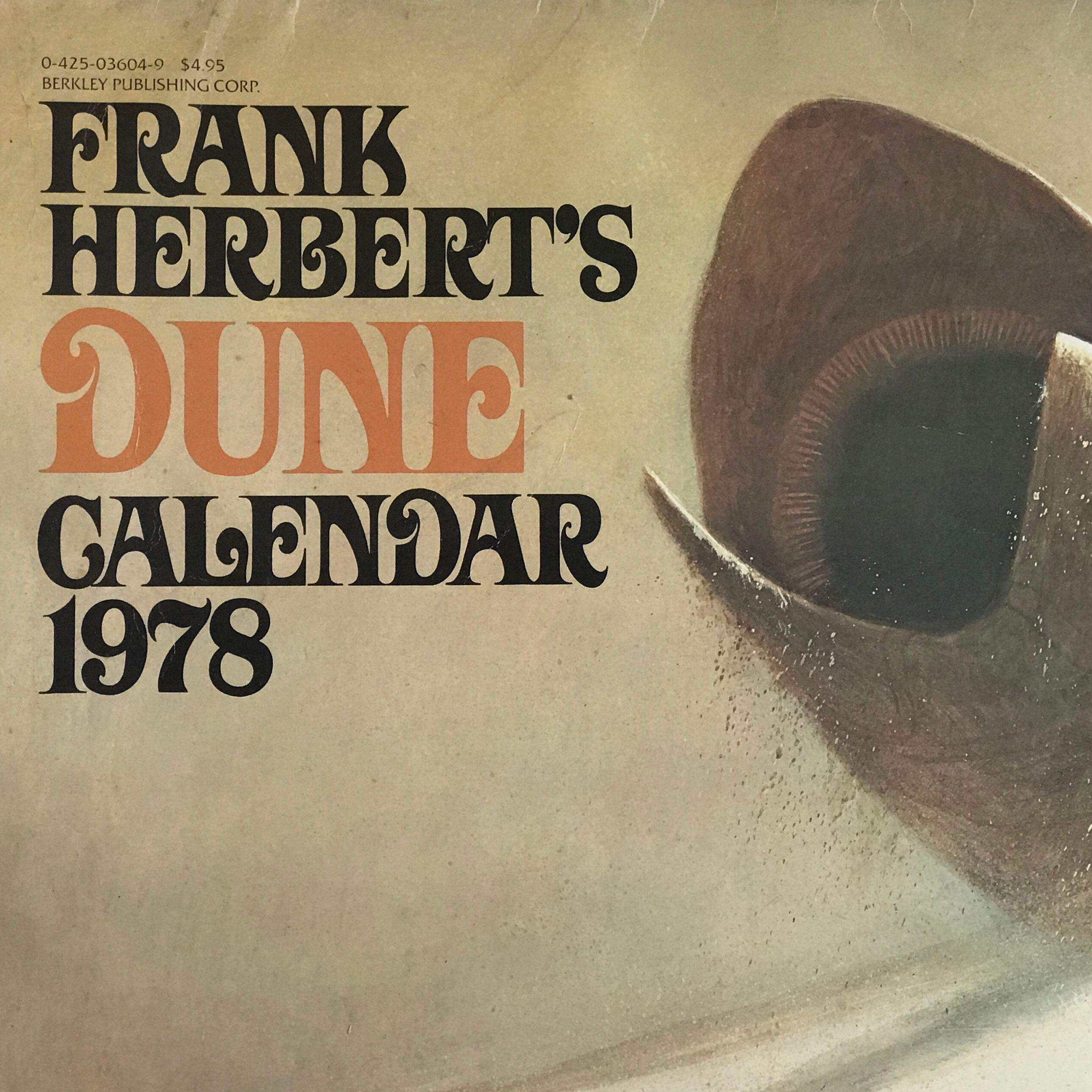
Whether the Dune series is your cup of tea or not, anybody who’s spent more than a little time in the sci-fi section of a book store is likely familiar with the series’ book covers and the unusual typeface. I caught a link off the Orange site to a story on Fonts In Use about the history of the typeface that graces Frank Herbert’s series, and it’s right up my alley.
My dad had a few lettering books lying around the house at all times. The Speedball Textbook for Pen and Brush Lettering being the book I remember best. (And have a copy of, though it’s getting infrequent use.) He’d refer to them sometimes when laying out signs or patterns for lettering on vehicles. He’d have to improvise when adding characters that weren’t in the books or weren’t quite right.
All that to say, interesting lettering always catches my eye. What I know about Dune, as a series, hasn’t compelled me to pick up any of the books. But the covers? I have to say, the lettering does call out to me.
The font was drawn by Meyer M. “Dave” Davidson for a typesetting company in New York (PLINC) and first showed up in the PLINK 1967 Alphabet Yearbook. From there it made its way onto some of Herbert’s paperbacks and then became part of the “visual identity” of his books.
The post goes into great detail and has lots of cover images and the history of Davidson Art Noveau. No spoilers here, I encourage folks to go read the post and check out all the wonderful book covers.
Today we all have thousands of fonts at our fingertips to choose from, of varying quality and ranging from open source to proprietary licensing. I’m not entirely convinced things are better though.
